
Minimizing Production Setbacks in Visual Development
The "Zero-Revision" Workflow: How I Align with Art Direction Before Drawing a Single Line and Avoid Setbacks
One of the biggest anxieties in visual development, for both the artist and the client, is the "Big Reveal."
You know the moment: The client sends a brief. The artist disappears for a week. The artist returns with a polished render. And then… silence. Followed by, "This isn't really what we had in mind."
That gap cost money. It costs time. And worst of all, it burns through the creative energy of the team.
Over the years, I’ve developed a process designed to kill that anxiety. I don't just "take a brief and draw." I act as a visual translator first. By the time I actually put pen to tablet for the final character design, the client and I are already so aligned that the final result feels inevitable, not lucky.
Here is a breakdown of how I tackled a recent project for a "Gentle Giant" and a Stylized Female character, using a Visual Mapping technique that keeps revisions to a near-zero minimum.
Step 1: Deconstructing the "Vibe" (The Brief)
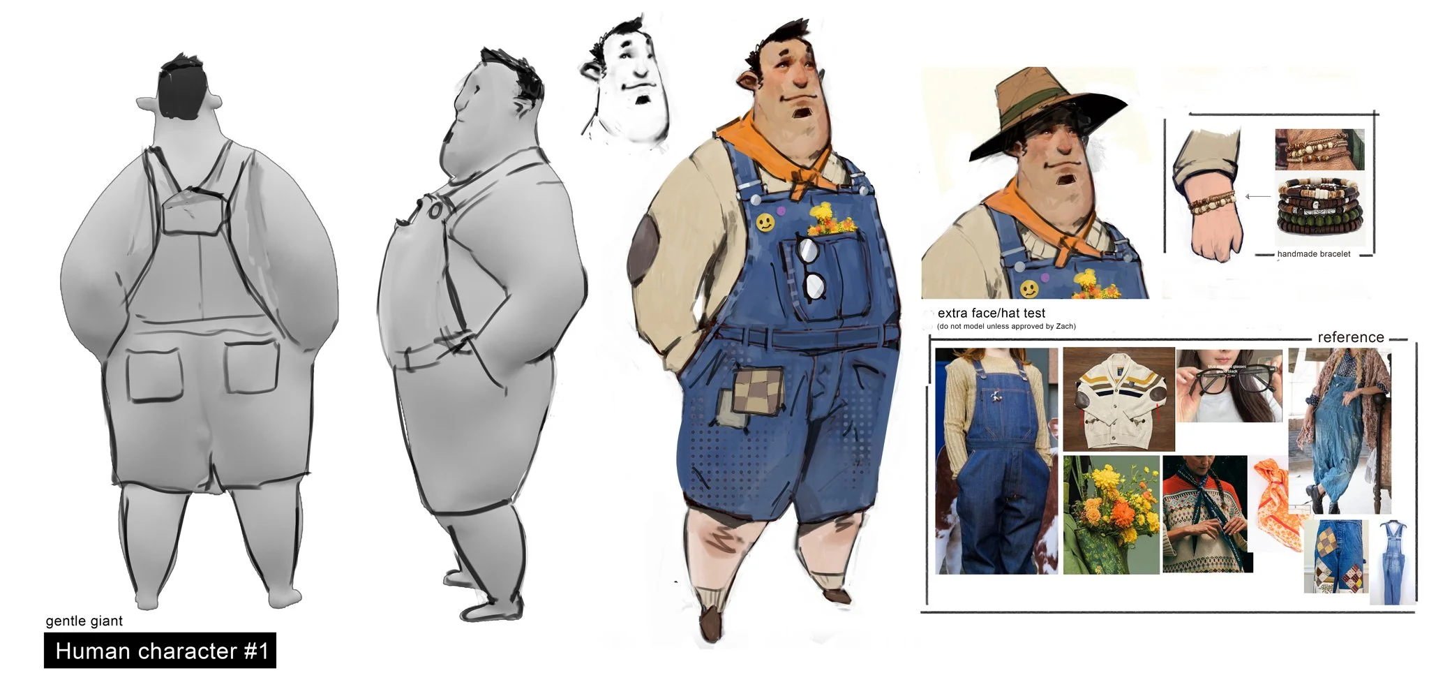
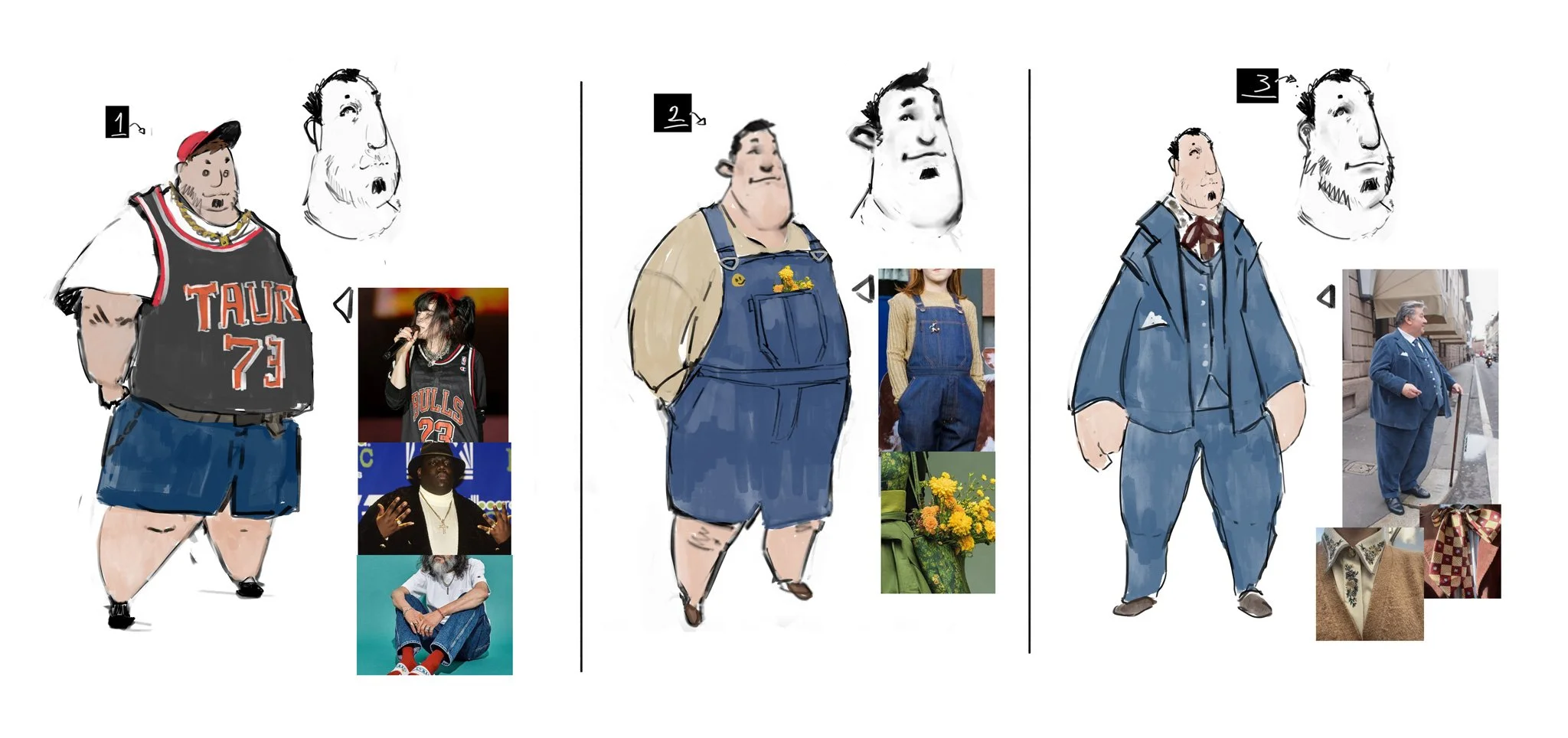
The client came to me with a specific, yet tricky request for a "Gentle Giant" character.
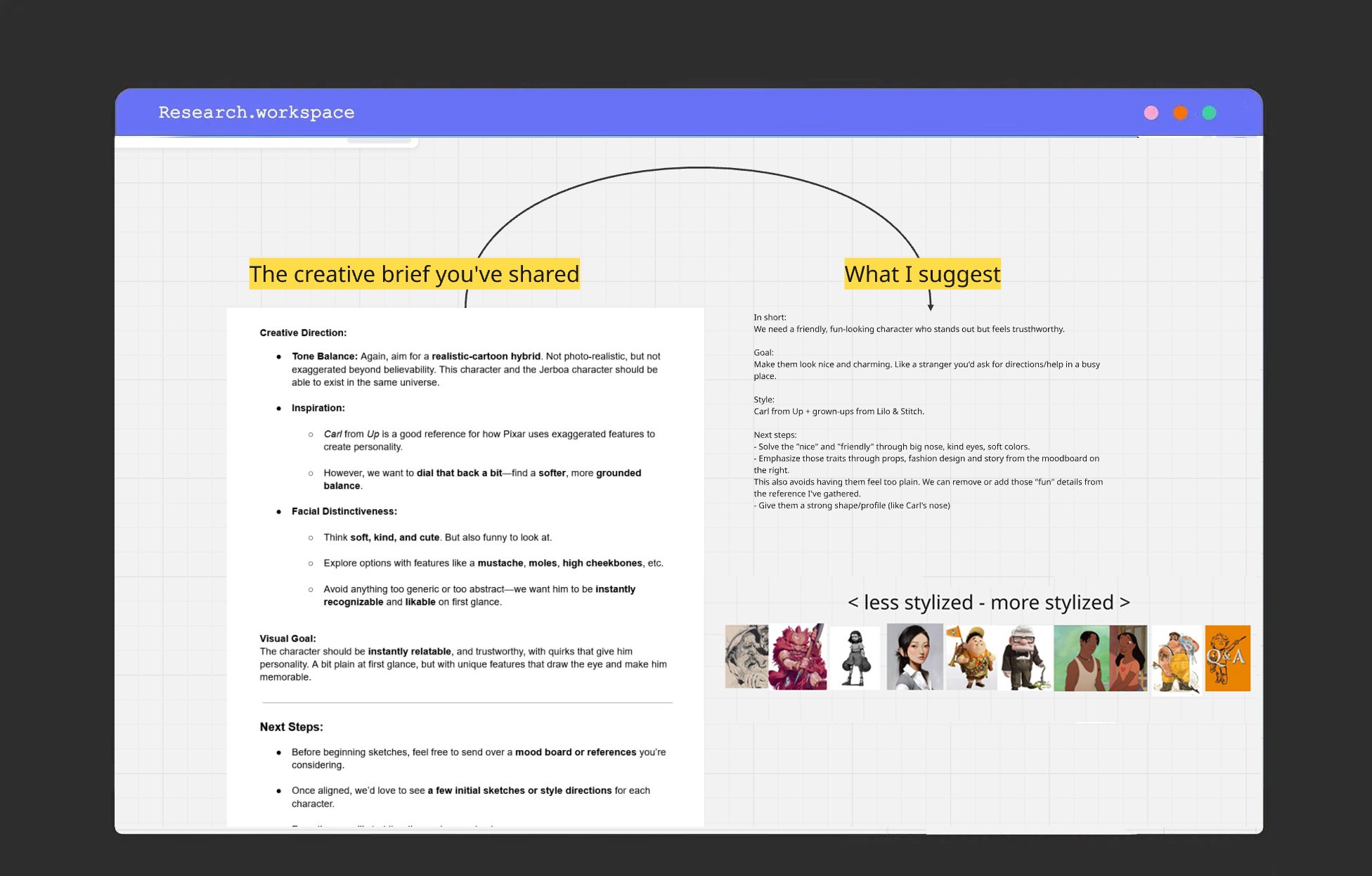
The Creative Direction:
Tone: A "Realistic-Cartoon Hybrid." (This is often a trap; it means different things to everyone).
Inspiration: Carl from Up, but "dialed back" and more grounded.
Personality: Soft, kind, cute, but funny to look at. Instantly relatable.
Many artists would read "Carl from Up" and immediately start drawing square jaws and glasses. But I needed to dig deeper. I looked at the brief and mapped out what I call a Visual Strategy.
Pro Tip: I use tools to literally draw a line between their words and my visual interpretation. I explicitly tell clients: "Stop me in my tracks if this is off."
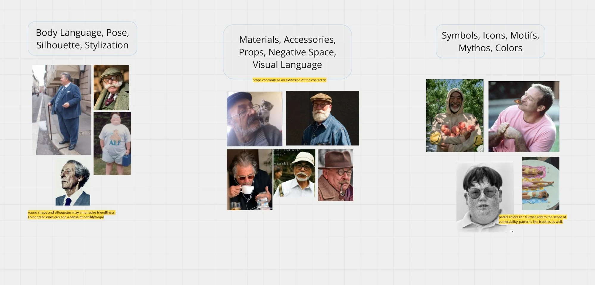
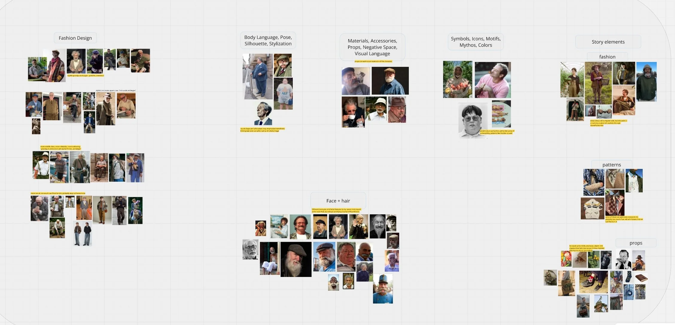
Step 2: Visual Mapping & The "Safety" Mood Board
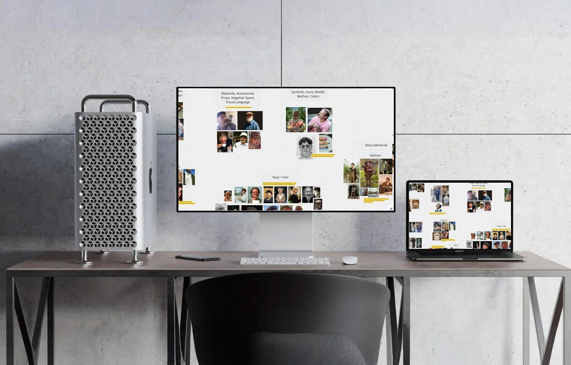
Before sketching, I create a comprehensive visual map. This isn't just a collection of pretty pictures; it's a conversation tool.
I gathered references of real humans, older men with soft eyes, specific fashion textures (knitwear, corduroy), and props (flowers, vintage glasses). I placed these alongside stylized references (Lilo & Stitch, Disney vis dev) to find the "middle ground" the client asked for.
Why this works for Art Directors: I presented this research board before doing any heavy lifting.
If I’m wrong here, it costs our production $0 to fix.
If I’m wrong later, it costs days of labor.
We agreed on the "Soft Giant" aesthetic, overalls for a blue-collar feel, but soft fabrics and flowers to sell the "gentle" personality.
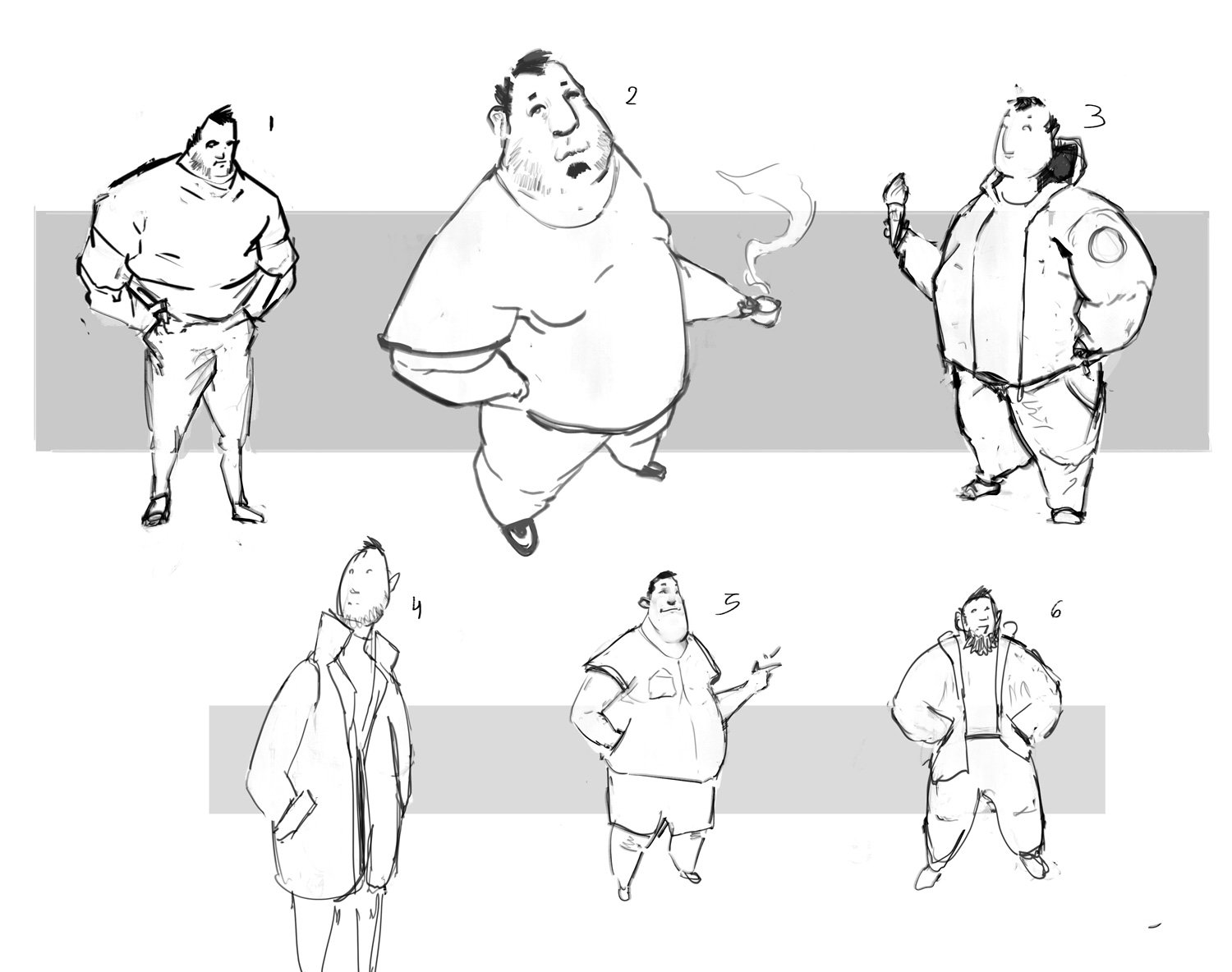
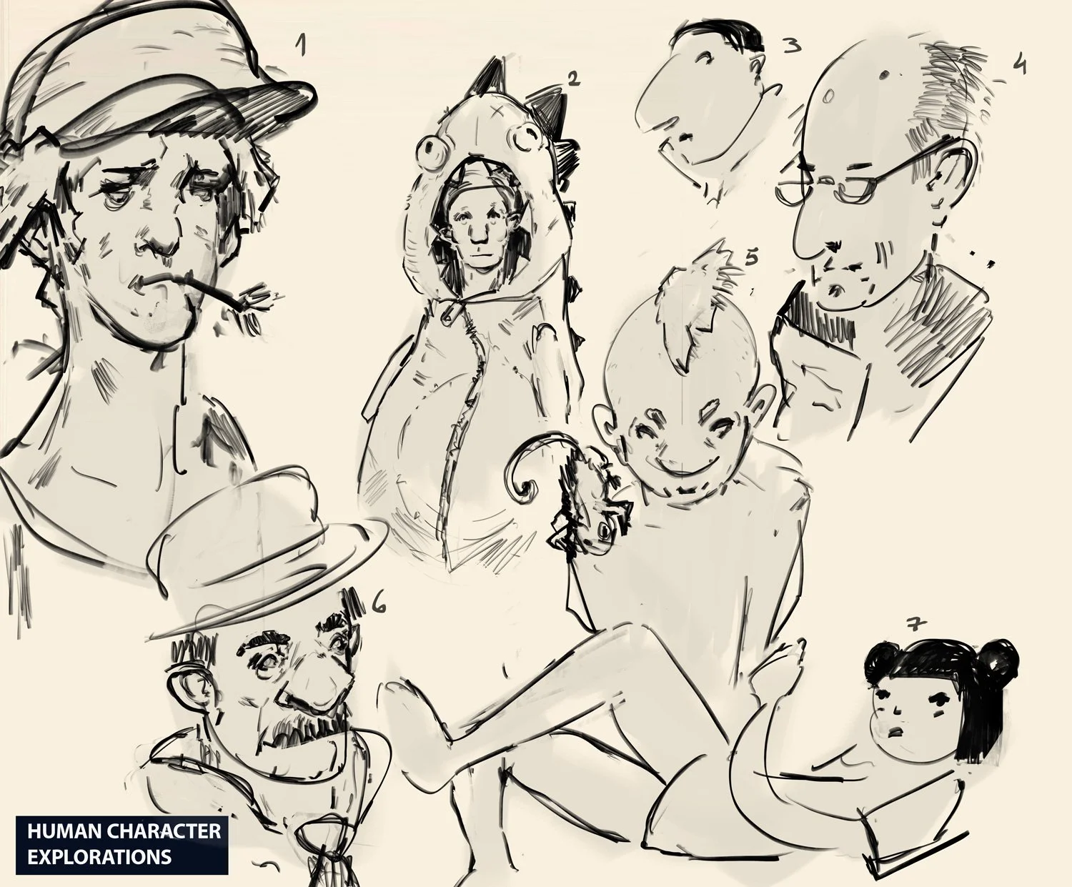
Step 3: Thumbnailing with Confidence
Because the client had already signed off on the ingredients, cooking the meal was easy.
I moved into silhouettes and thumbnails. For the female character (a stylized Asian woman), we needed a "cute but grounded" look. Because we had already established the shape language in the research phase, I could explore poses that felt natural to the character immediately.
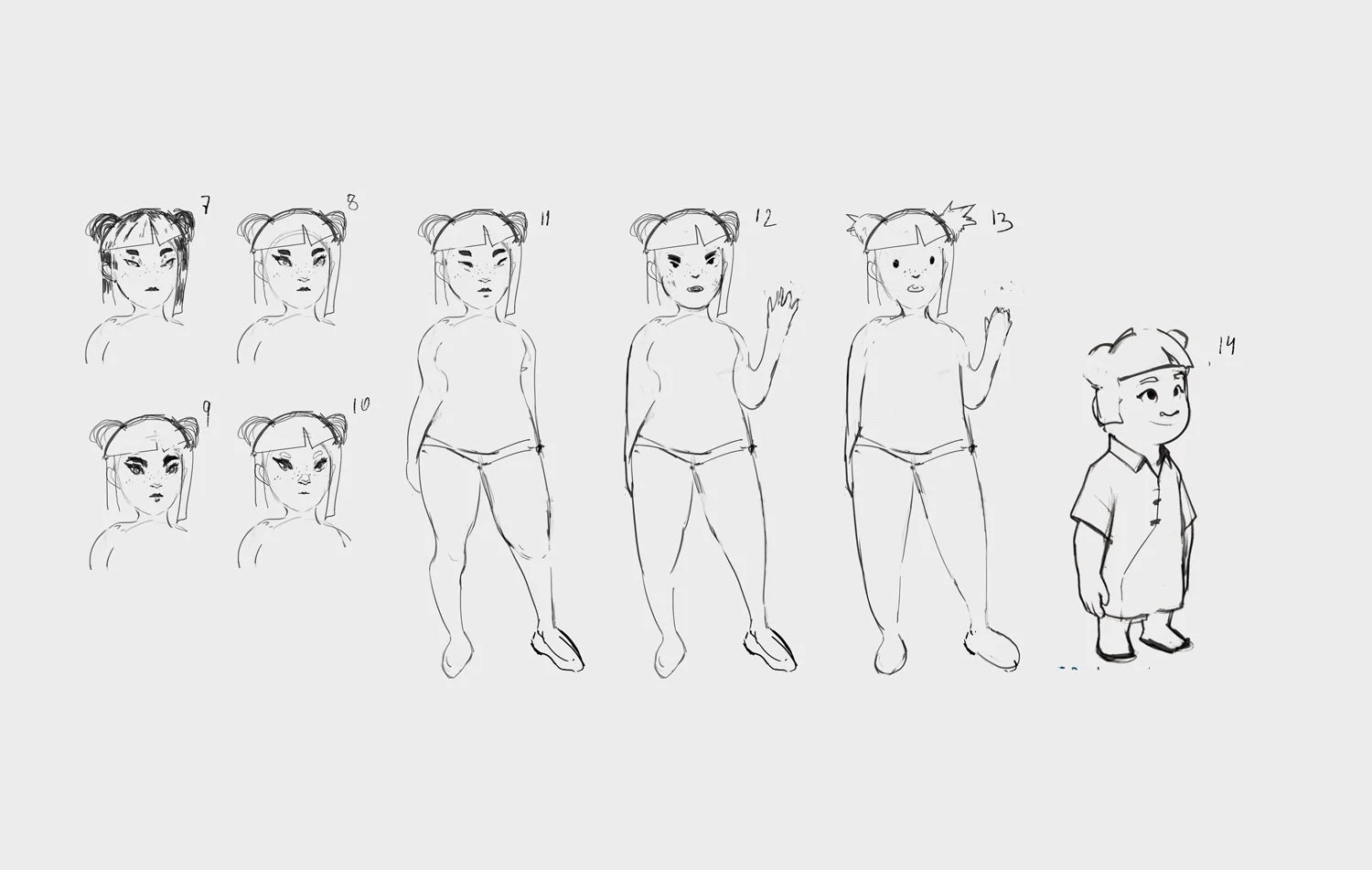
I was referencing the art of Pixar, Sinix and Jon Foster a bit, as per client request.
For the Gentle Giant, notice how the shape language remained consistent with the "Carl from Up" inspiration but stayed grounded in the reality of the photo references we chose. The client could see the direct lineage from the mood board to the sketch.
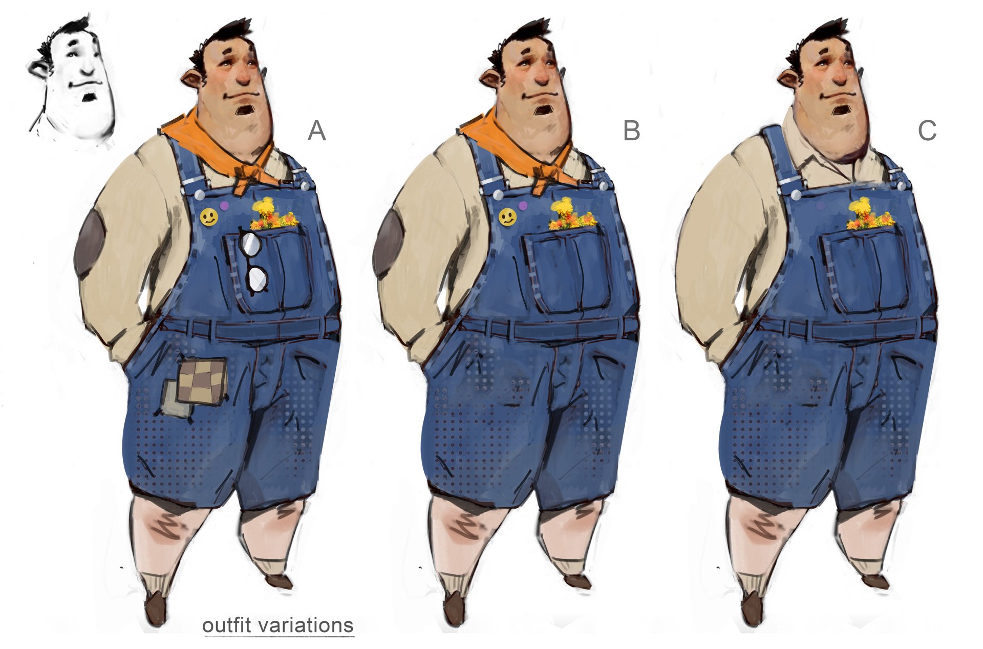
Step 4: The Details tell the Story
The "Realistic-Cartoon Hybrid" style lives or dies in the details. If you make the proportions too crazy, it breaks the "grounded" rule. If you make the textures too photorealistic, it breaks the "cartoon" rule.
For the final Gentle Giant design, we nailed this balance through:
Props as Story: The flowers in the dungaree pocket instantly tell you he is a nurturer, contrasting his size.
Texture: The rendering style is painterly but the materials (denim, cotton) read as real.
Shape: A strong, heavy base (trustworthy) with a softer, rounder face (friendly).
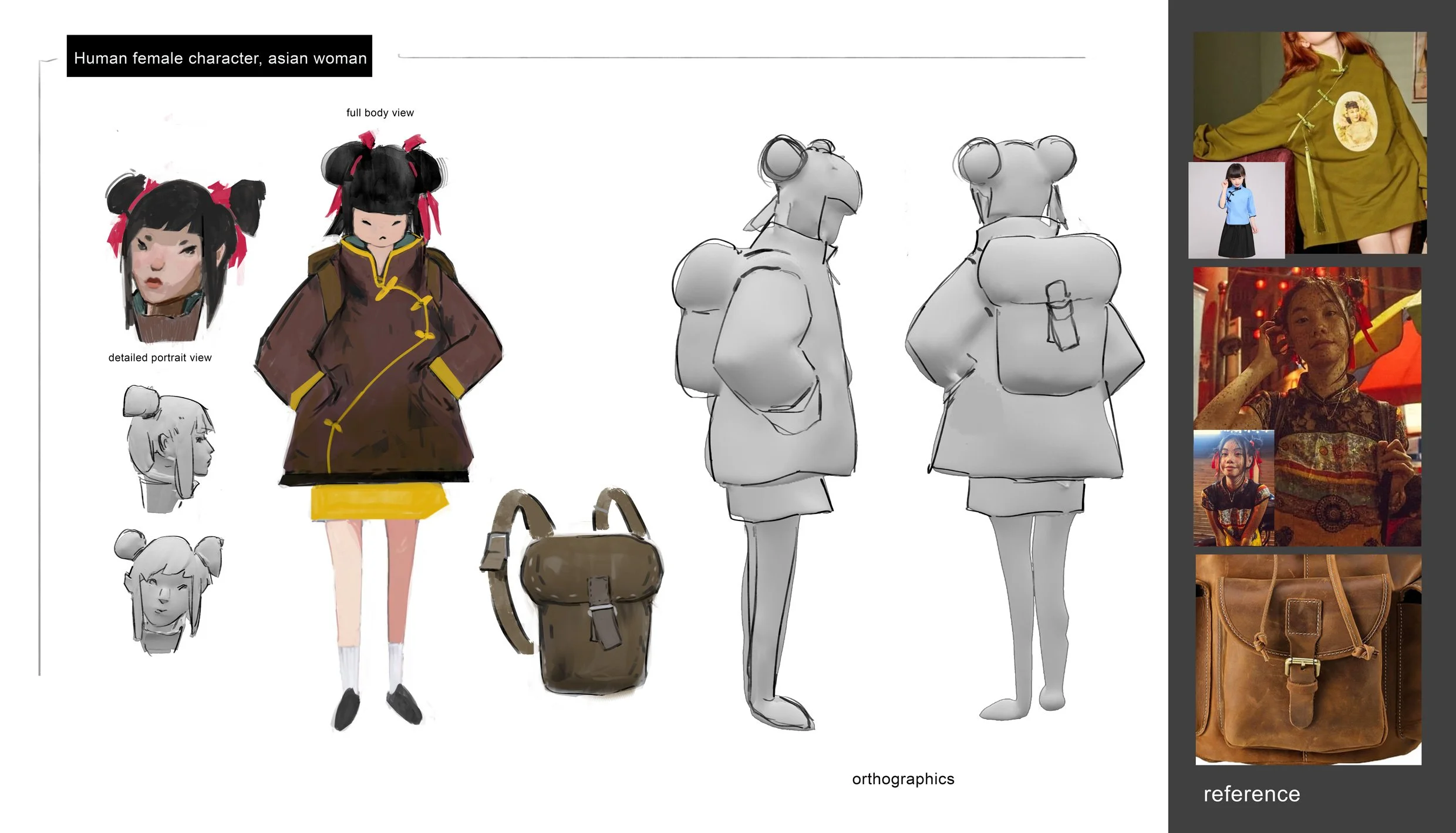
We applied the same logic to the female character. Her backpack, the toggle coat, and the specific "pouty but focused" expression were all elements we curated in the mood board phase, making the final render a breeze to approve.
The Takeaway for Producers and Directors
If you are hiring a concept artist, you aren't just looking for a good hand; you are looking for a good ear.
The most expensive part of production isn't the hourly rate of the artist; it's the cost of misinterpretation. My workflow is built to eliminate that cost. I heavily front-load the "thinking" and "listening" phase so that the "drawing" phase is efficient, high-quality, and exactly what you envisioned (or better).
Are you looking for a Visual Development partner who respects your pipeline and minimizes revision loops?
Let’s chat about your next project. I’d love to help you map out your visual strategy.