
Here’s Everything Wrong With Your Indie Game
I’m a AAA Freelance Concept Artist, Art Director, and Creative Marketeer in the Games Industry. Whenever I surf Reddit, the algorithm loves to push posts from Game Developers into my feed. Most of these developers are posting because they need help improving their games. This post genesis comes from a time I commented on one of such threads, and the response was so positive. In this blog post, I decided to share more knowledge on how to make your Indie Game better.
In this short case study, you’ll find a breakdown of an Indie Game I made and the kind of tips I gave to improve it.
This kind of knowledge is fundamental to making your game better received by the market, earning more sales, and building a bigger following.
Here’s an example of an Indie Game that Needs Work
Our Indie Game Developers had a few insecurities about their work:
“We’ve been developing our game for three and a half years now, and we’re planning to release version 1.0 in January 2026. It all started as a small academic project, but we became passionate about it, as the first playtests showed us that the formula was working.
But here we are: with a game that seems to be loved by everyone who plays it, and yet we’re struggling to gain visibility. Positive reviews consistently exceed 90%, and players appear to remain engaged for extended periods.
We tried for two years straight to find a publisher, without success, so we started marketing on our own very late in development. However, we still can’t see any organic growth on our Steam page. Our biggest issue involves content creators, as only a few small streamers have responded to our emails.
We even spent a big chunk of our limited budget on a paid creator campaign, but it didn’t bring us any results.
With just a few months before release, we’d like to have a better understanding of what we might have done wrong, especially why the game doesn’t seem to catch players’ interest. For this reason, we’re asking for your opinions and any feedback will be much appreciated.
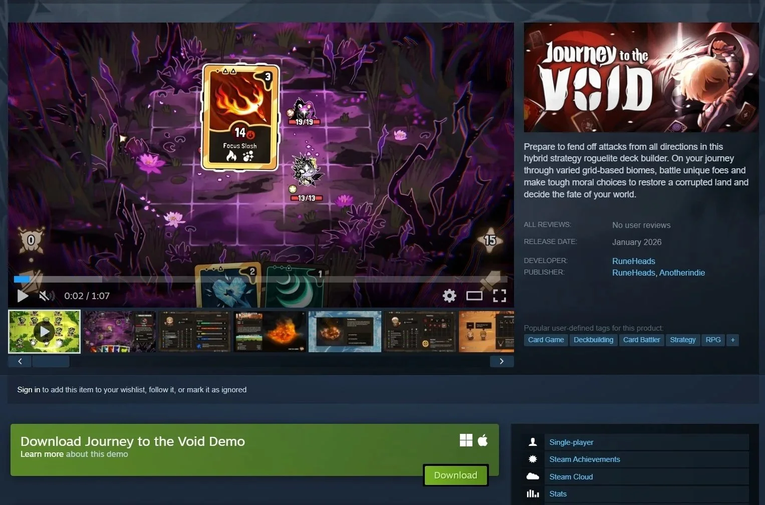
The game is called Journey to the Void; you can check it out on Steam.”
How to Present Your Indie Game Better in Less than a Minute:
Don’t sell your game to fellow game developers.
The text here needs better storytelling; they used game dev jargon to promote their game to non-dev people.
The original: "Prepare to fend off attacks from all directions in this hybrid strategy roguelite deck builder. On your journey through varied grid-based biomes, battle unique foes and make tough moral choices to restore a corrupted land and decide the fate of your world."
It’s just so hard to read as a consumer that I almost fall asleep mid-sentence while reading. I don’t want to have to figure out what your game is about; I want you to tell me!
Here was my suggested rewrite to hook immersion: "It's now or never! You're the commander, and the fate of the land rests on you. Prepare to fend off attacks from all directions, embark on a unique journey to restore a corrupted land while fighting foes as well as ethical dilemmas for the greater good."
What this does: gets rid of the game dev jargon, puts the reader into the story and in the first person, and in a position they care about playing. It doesn't need to be 1:1 like this, but the customer/player IS THE MOST IMPORTANT PART OF YOUR PRODUCT; if you don't put them at the center, then yes, they won't care about it. People are selfish by nature; we all have an ego. Play with that. Give them the responsibility to do something they want to do.
Good Graphics Aren’t Everything. Use Your Art as a Means of Communication
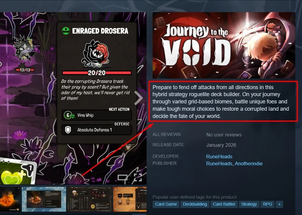
I went through all the screenshots. The graphics are good, the presentation is nice, but I still don't know what the heck I'll be doing in the game. I could guess, because the grid style is similar to other games, but that's not a great point of comparison for anyone who comes across your project. You need to make your project stand out, and what's so unique about it?
EG: I remember a time game developes from Witcher were showcasing the way you can ride the horse in the game, and it was similar to Red Dead Redemption, the horse felt nice to watch, so I'd guess even better to play, AAA does this well, they hook you into an experience of gameplay, curate the clip, show it to get the audience excited. I recommend making a short, exciting clip of the actual gameplay and adding it in real-time.
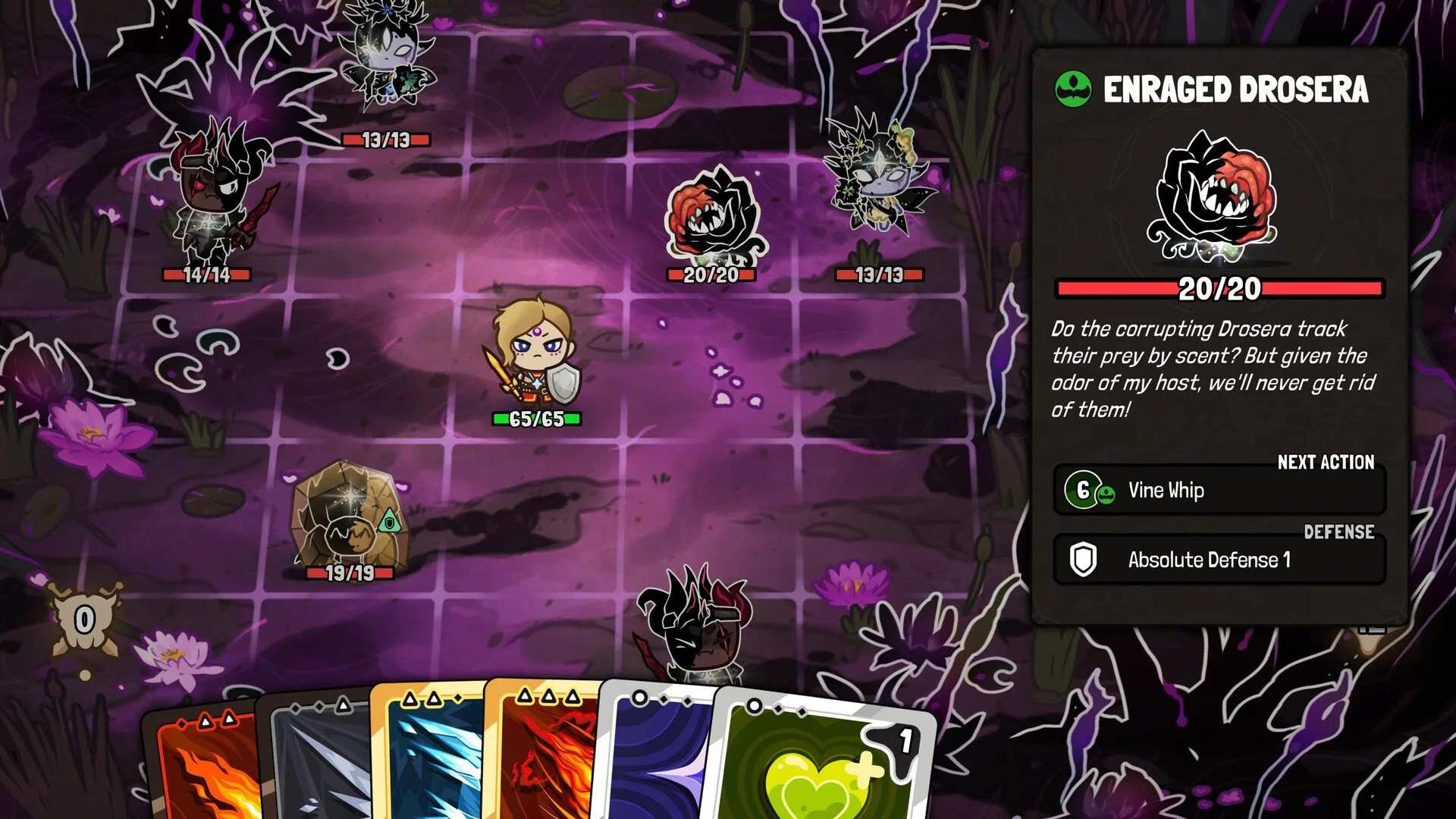
Oh, I kind of know what this game is about; it looks like those other games that have cards, take turns, and have grid-based combat. — This is an awful selling point, if you want it to look unique and recognizable, and I’ve highlighted the reason in bold.
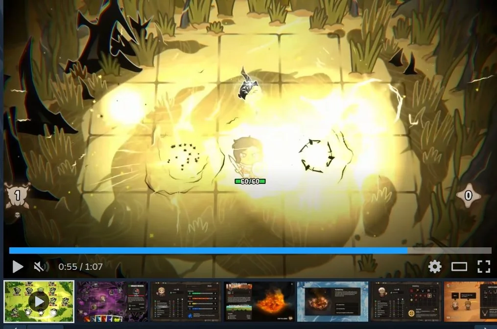
By the end of your trailer, I'm still unsure of what the game is about. The first thing that auto-plays is the head trailer on the Steam Page; I understand they were using a TikTok-style of flashing video clip sequences, with explosions, VFX, and other entertaining elements. The game seems to be slow-paced in gameplay; it doesn't mesh well together. The energy here in the trailer should be: informative, inspirational, and to generate hype. This is the kind of trailer that does neither of those.
If the game has slow gameplay mechanics, maybe play a piece of lore instead to hook the player with interest and curiosity, and then show off the mechanics and such, but never have a slow-paced game, presented in a fast-paced action trailer.
Everything About your Capsule Art is your Indie Game Business Card
The steam capsule art looks a bit confusing; the font is good, I like it, but the name sounds almost like a death metal band, perhaps too serious for the kind of art style it is. It's not a deal breaker, though, something to think about, because right now the font conflicts a bit with the character. Similarly, just by looking at the steam capsule art, I still have no idea about the lore or what it is about. There's a teenager with a sword, cutting down on something that seems undecipherable to me. I’m sure it is meaningful, and it means something, but it can quickly become an inside joke that only the developers understand. And remember, this game isn’t for you, it’s for your customers.
Your Art Style May Not be Wrong, but It’s just Not Efficient
The Art style is acceptable, not bad, not great, it's good, it's better than average, it doesn't look bad, but that's also part of its problem, it's safe, it's like it's afraid to stand out.
There are far too many different colors in the UI; it’s best to pick a couple of colors for the most important elements to avoid user eye fatigue.
As a game developer, focus should also be on posting on social media, being active in your own Discord and Steam community, and using the Steam platform to create content.
There's a lot more I could go into, but I hope this helps you just the same way it helped the game developers over at Reddit.
About the Author: Miguel Nogueira is a veteran Concept Artist, Art Director and Creative Marketeer with a focus on Games Industry, he is usually a lot nicer and runs with a lot more empathy than the style he gave the above criticism, however, it was the developers request that they’d be served a blunt critique, which is sometimes the most constructive way to get to the bottom of the issue.
Miguel has contributed to such titles as Arc Raiders by Embark Studios, Battlefield 2042 by Electronic Arts DICE, and Tom Clancy’s The Division 2 by Ubisoft, to name a few. He is currently open for consulting calls, and you can request one for an hourly fee by simply emailing him.